Nola du Toit

I help organizations turn complex data into clear insights, 
guiding teams and researchers to communicate with impact.


PORTFOLIO

Over the past 15 years, I’ve strategically helped build NORC’s data visualization capabilities, leading initiatives that span diverse topics and clients. I collaborate with data experts, statisticians, designers, IT, communications teams, and subject matter specialists. I’ve designed and managed projects, guided teams, developed training and mentorship opportunities, and worked closely with clients to help present and disseminate their work to leadership and stakeholders, ensuring clarity and impact. I also established NORC’s data visualization principles, creating a company-wide guide of best practices and standards. These are now part of staff onboarding and training, ensuring that NORC’s visualizations consistently meet both industry and my own high standards.

See my full Resume for more examples.

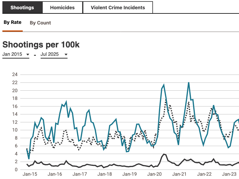
Chicago Public Safety DataHub

An interactive platform that visualizes crime trends, criminal justice system performance, and community safety perceptions across Chicago neighborhoods. Developed through a collaboration between NORC and the Civic Committee of the Commercial Club of Chicago, the DataHub serves as a non-partisan resource for residents and policymakers.

I led the design and development of data visualizations, ensuring they aligned with the overall user experience and storytelling objectives. I collaborated closely with the client to meet design expectations and managed the data integration and quality control processes for the interactive features. Because NORC had not previously integrated a D3 tool set into AEM, I worked closely with developers and IT to troubleshoot and implement the solution successfully.

Tools Used: Data Visualization & Development: JavaScript, D3.js Collaboration & Project Management: Jira Hosting & Deployment: AEM

Explore the Site
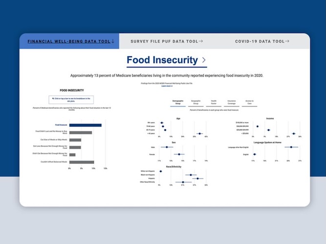
MCBS Interactives: Empowering Public Access to Medicare Data (Award Winning Dashboard)

The MCBS Interactives platform offers interactive dashboards that present statistically accurate, weighted estimates from the Medicare Current Beneficiary Survey (MCBS). These dashboards cover various topics, including financial well-being, health status, insurance coverage, and the impact of COVID-19 on Medicare beneficiaries.

As the project lead, I was responsible for designing the user experience and data interaction flow. I collaborated closely with IT to determine the best approach for hosting the R Shiny application within the organization's web infrastructure. Additionally, I coordinated with statistics teams to ensure accurate data representation and with communications teams to align the tool's messaging with the organization's objectives.

Tools Used: Data Visualization & Development: R Shiny, D3.js Collaboration & Project Management: Jira Hosting & Deployment: AWS, internal web infrastructure (in collaboration with IT)

Explore the Tool

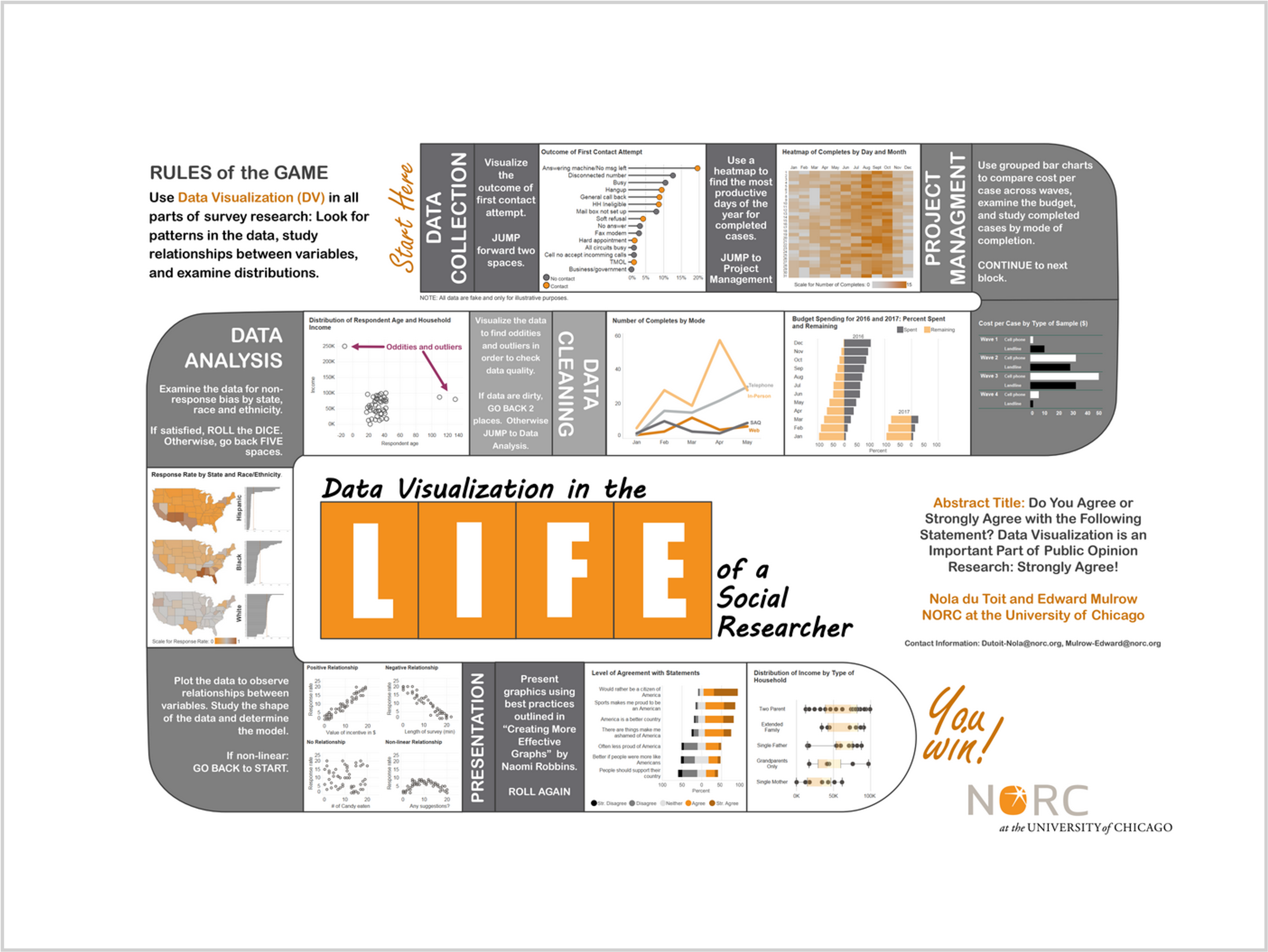
Data Visualization across the Survey Lifecycle

A flow-chart style infographic that illustrates how data visualization can enhance every stage of survey research at NORC, from data cleaning and processing to budgeting, modeling, and presentation. The poster presents each stage with examples of how visualizations can improve understanding and decision-making. Originally presented at the American Association for Public Opinion Research (AAPOR) 2017 annual meeting.

I conceptualized and designed the poster from scratch, collaborating with Ed Mulrow to highlight opportunities for data visualization throughout the research lifecycle. I created the layout and visuals in PowerPoint, making complex processes accessible and engaging for a professional audience.

Design & Visualization: PowerPoint Collaboration: Internal consultation with survey research teams

Explore the Poster

Virtual Reality Data Viz

This immersive virtual reality (VR) video allows users to experience differences in U.S. house sizes by region and demographics. Utilizing data from the U.S. Census Bureau and the 2015 Residential Energy Consumption Survey, the project visually demonstrates how income levels and regional factors influence housing sizes across the country. Viewers can engage with the content using a VR headset, desktop pan controls, or mobile devices, providing an interactive and educational experience.

As the project initiator and lead, I conceived the idea and secured internal funding to bring it to fruition. I designed the entire concept, focusing on creating an engaging user experience that effectively communicates complex data through VR technology. I identified and collaborated with a vendor specializing in VR production, overseeing the development process to ensure alignment with project goals. Additionally, I coordinated with internal teams, including data analysts and communications, to integrate accurate data and ensure the final product met organizational standards.

Data Sources: U.S. Census Bureau, 2015 Residential Energy Consumption Survey VR Development: Collaborated with external VR production vendor Project Management: Internal collaboration and oversight

Read More & Watch the Video

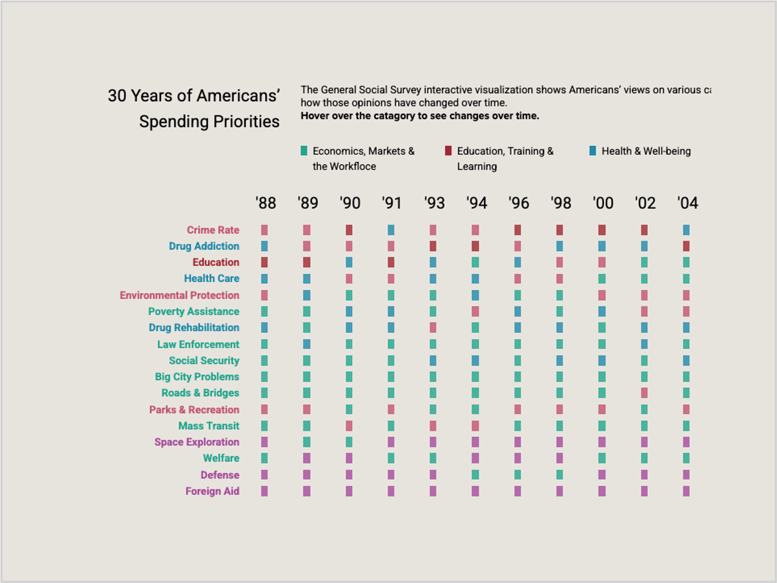
30 Years of Americans’ Spending Priorities

An interactive visualization based on the General Social Survey (GSS), illustrating how Americans' views on government spending have evolved across various categories over three decades. Users can explore trends in areas such as education, healthcare, and defense.

I led the design and development of the interactive experience, collaborating with the GSS team to identify key spending categories and trends. I ensured the visualization was both informative and user-friendly, facilitating an engaging exploration of long-term public opinion data.

Data Visualization & Development: D3.js, JavaScript Hosting & Deployment: AWS

See the Rankings

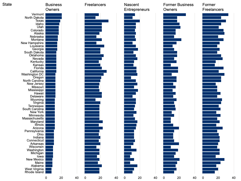
EPOP Interactive Dashboard

An interactive Tableau dashboard visualizing data from the Entrepreneurship in the Population (EPOP) survey. The dashboard enables users to explore entrepreneurial activities across various demographics and geographies, providing insights into self-employment, business ownership, and related experiences. Hosted on the EPOP website, it serves as a user-friendly tool for researchers and the public to access and analyze EPOP data.

I designed and developed the initial platform and interactive visualizations in Tableau, collaborating closely with the project team and client to ensure the data story was accurately represented and effectively communicated. I worked with IT to use Tableau Public’s public server for hosting and embedding the dashboard into the AWS-hosted website, ensuring seamless integration and accessibility.

Tools Used: Data Visualization & Development: Tableau Collaboration & Project Management: Jira Hosting & Deployment: Tableau Public, AWS

Explore the dashboard

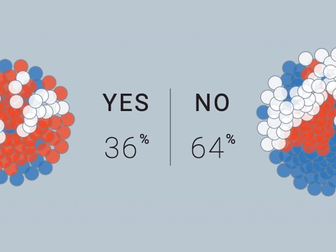
Tracking Americans' Opinions & the Media that Inform Them

This interactive data visualization, developed for the AP-NORC Center for Public Affairs Research, explores how Americans' political affiliations influence their news consumption habits and perceptions of media accuracy. Based on a 2017 survey of 2,036 U.S. adults, the project highlights partisan divides in trust and engagement with various media sources.

As the lead designer and developer, I was responsible for transforming complex survey data into an intuitive, interactive experience. I designed the user interface to allow users to filter and compare responses across political affiliations, ensuring clarity and accessibility. Additionally, I implemented responsive design principles to ensure the visualization was accessible across devices.

Data Visualization: D3.js for dynamic chart rendering

Web Development: HTML, CSS, JavaScript

Play with the Bubbles

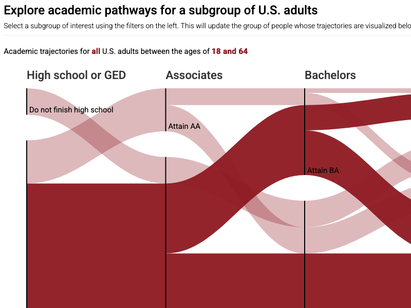
National Education and Attainment Survey (NEAS)

An interactive platform developed to visualize the educational and training trajectories of U.S. adults, focusing on postsecondary credentials and their impact on employment outcomes. The platform includes tools for analyzing educational pathways, comparing outcomes across demographic groups, and examining certificate attainment. It was created using R Shiny and D3.js.

I designed the initial platform and the "Trajectories" interactive tool, setting the foundation for the user experience and data visualization approach. I managed the development team, encouraging innovation and collaboration. Team members proposed additional features, which were reviewed collectively and integrated as new tabs on the platform.

Tools Used: Development & Visualization: R Shiny, D3.js Collaboration & Project Management: Jira Hosting & Deployment: AWS

Explore the Trajectories